I’ve been wanting to take control of my blog theme for some time in order to both simplify how everything was being displayed, and to obtain a greater degree of flexibility over time. There are a lot of great themes out there for WordPress, and I’ve been fairly happy with many of those I’ve tried – but they still were not exactly what I wanted.
I decided to come up up with something of my own by creating a child theme of the default WordPress “TwentyTen”. Seeing as how I don’t need many features on here, and that “TwentyTen” is a modern design that supports all the new 3.0 features, a child theme sounded perfect. I also tend to shift these around over time, and this would allow that as well.

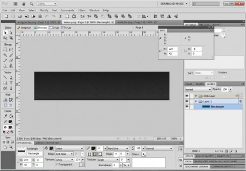
The first thing I did is sketch out on paper a sample of the sort of layout I was looking to create. I then created a basic measured layout in Fireworks, followed by a number of textured image segments for the navigation menu, page background, and content area. Fireworks is great for stuff like this, due to the robust texturing system available.

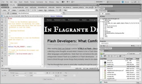
Dreamweaver CS5 has extended support for PHP-based CMS and blogging systems like WordPress. During prerelease, I was playing around with these features quite a bit but had actually never done any work with the final release. It’s actually very convenient to be able to view and interact with the live website files (on my testing server, of course) while designing and tweaking elements of the theme. Dreamweaver can also be enabled to provide code-completion for core WordPress functionality, although I didn’t need it in this case.
Most of what I did was remove a lot of the header stuff I didn’t need, and create a custom navigation menu along the top of the page. The rest of the work was just a lot of CSS hack and slash to get things looking right, setting up new elements, and skinning everything with my exported images. It actually went a lot more smoothly than anticipated.

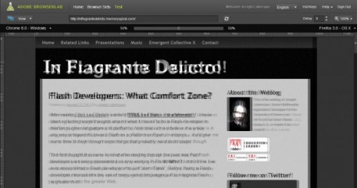
Most of the cross browser rendering checks were done on my local machine using Chrome 8, FireFox 4 beta, and Internet Explorer 8. I have other machines I could log into and check browsers like Opera or the IE9 beta, but don’t have a way to test on OSX from my home. Anyone familiar with DropFolders knows the snails-pace I take when it comes to doing any Apple stuff… So I fired up BrowserLab and was able to check my basic design rendered on what must have been nearly 20 different browsers across Windows and OSX.
It is interesting to see how relatively similar the design rendered across browsers. The most trouble that I noticed was lack of support for my embedded fonts in older browsers. You can also see in the above image that we definitely have some shifting going on in regard to the positioning of elements on the page, but nothing so terrible to render the design unusable.
I’m very pleased with both the resulting design, and the simple, unified workflow involved in getting to this point. There are lots of little things that will probably come up which I’ll modify in the future… but it’s great to know now how very simple it will be to do so.